Intern Orientation: Learning about state, county and city disparities through an interactive workshop.
Objectives:
Familiarize yourselves with the Cincinnati community including examination of local geography, health disparities and public health issues.
Describe the connection between health disparities and the social determinants of health (SDH).
Compare key population characteristics (gender, race, insurance type) to local health disparities.
Explore future interventions you might take to ensure health equity for all your patients.
Before we begin, please take the pre-test
As you go through this activity be thinking about what you will share during the group debrief. This may include:
What surprised you the most?
A key concept you will take away with you.
1 thing you can do different over your 3 years of residency to improve health equity or address public health problem for our region. (This can and should be something small and within your zone of control.)
Station 1: Local data
Let’s start with the Cincinnati Health Department Community Health Assessment report from 2017.
On pages 24-26 you will find demographic data of the city. How dose the city’s profile compare to Hamilton County for age and race?
On pages 27-30 you will find data on the prevalence of social determinants of health. Using Table 2 & 3, how does the city compare to the county and state for:
Income (table)
Poverty (table 2 & 3)
Transportation (table 2)
What percent of children living in the city are homeless (page 29)?
It’s now known that your zip code has a greater impact on your life expectancy than your genetic code. Examine the interactive life expectancy map and chart. Find the FMC’s neighborhood (Mt Auburn). What is the difference in life expectancy (as measured in years) between the following communities:
Mt Auburn & OTR
Clifton & Avondale
Mt Lookout & Linwood
Your neighborhood (if you live within city limits) and Mt Auburn
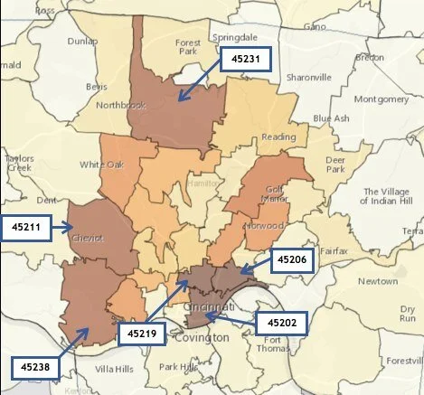
Below you will see a static map of zip codes. In 2016 zip codes for every patient in the FMC (>7000 patients!) were pulled and then uploaded to HealthLandscape. Darker areas indicate a greater percentage of patients living in that zip code. What are the top 3 zip codes where FMC patients live? Which neighborhoods correspond? (You may want to use this table to help you sort it out.)
It is now well documented that there are specific race-based health disparities associated with the spread and treatment of COVID-19. Visit the City of Cincinnati COVID tracker.
Which neighborhoods have the highest prevalence of COVID? Why might that be?
Does the city’s racial breakdown of cases track with what you know to be true? What other data might you want?
Station 2: County level data
Please use the Community Health Needs Assessment 2019 report to answer the following questions.
Look at pages 58 & 59. Insurance coverage rates in Ohio have improved in the past few years. But having insurance does not mean that there are no longer barriers to accessing healthcare services. Take a look at the graphs depicting responses from consumers (patients) as well as agencies (i.e. nonprofit organizations) and the health department. What are the barriers from the patient’s perspective? How do they compare to the barriers identified by agencies and the health department?
Look at pages 38 & 39, and Figure 7 on page 68. This is data of health disparity risk as measured by Community Needs Index (CNI). What does the CNI help us to understand about health disparities in our county? (You can read more about the CNI here.)
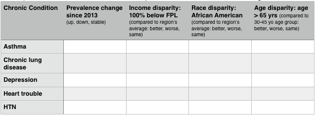
Click on the Community Health Status Survey results from 2017. For greater Cincinnati, please note any changes over time in the prevalence of chronic conditions and disparities based on income, race and age. You may want to make a table, similar to the one below. The tables on page 1 &3, and the graphs on pages 2-3 will help you to fill in the table.
Station 3: State level data
How have adult insurance coverage rates in the state of Ohio changed over the past 10 years? Which types of insurance have increase and which have decreased? What do think are influencing these trends?
Use this Ohio survey by Interact for Health to answer the questions
Opioid abuse from prescription drugs, heroin, and other opioid derivatives is an ongoing public health concern in the state of Ohio (and in our region specifically). Use this Ohio Department of Health (ODH) report to answer the following questions.
Review figures 3, 6, 7 & 10. What trends can you discern?
Now, look at figure 12. What do you notice about the map in general? About Hamilton County specifically?
Finally, examine the Health Policy Institute of Ohio’s addition policy inventory & scorecard and focusing on Figure ES 2 (page 3). What has Ohio done well thus far to address opioid use & unintentional overdose-related deaths?
Use the interactive map (map.feedingamerica.org) on the computer to view food insecurity rates in Ohio.
Now click on Ohio and find Hamilton County. What is the food insecurity rate?
Scroll to the top of the page and under demographics (on the left), select “child.” How does the food insecurity rate change?
Scroll to the bottom of the page and read about food insecurity, program eligibility and safety nets. How might food insecurity impact the health of your patients, both adults and kids?
Remember to take the post-test!
Additional Resources
Review the inter-connectedness of the social determinants of health
Review of health disparities and health equity
Glossary of poverty-related terms